Here are the settings I have used for making prints with Piezography Pro Community Edition. You can take them as a starting point. For every paper, there are actually 100 x 100 x 100 or 1 million toning combinations !
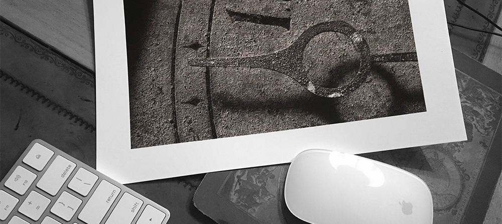
Ever since seeing the photography of Paul Strand, I have admired warm-toned prints. My favorite combination is Canson Infinity Platine Fibre Rag (which has a satin finish) and Piezography Pro inks. The resulting images are reminiscent of darkroom prints I made decades ago with Selenium-toned Agfa Brovira paper. They have very deep low tones due to Piezography's UltraHD black carbon pigment and unlike photos made with a matte finish, these prints are resistant to scuffs and scratches.
Make sure that the Quadtone RIP and Piezography Curves for your printer have been installed. Here is an example where we install curves on MacOS for the Epson 3800/3880 series printers:
- Turn on the printer and connect via USB
- From the Terminal, type cd /Applications/Piezography/Curves and click enter
- From the Terminal, type 3800-3880-Pro/Install3880-Pro.command and click enter
Be sure to follow the instructions in the Piezography manual, which is included when you download the package. This article was written in December 2020 and will likely become obsolete as improvements are made to the process. The manual will always contain the latest instructions.
Edit and save your photograph as a 16-bit black and white TIFF file, with the Gray Gamma 2.2 profile attached. In Photoshop you can soft-proof this image with the Gray Gamma 2.2 setting.
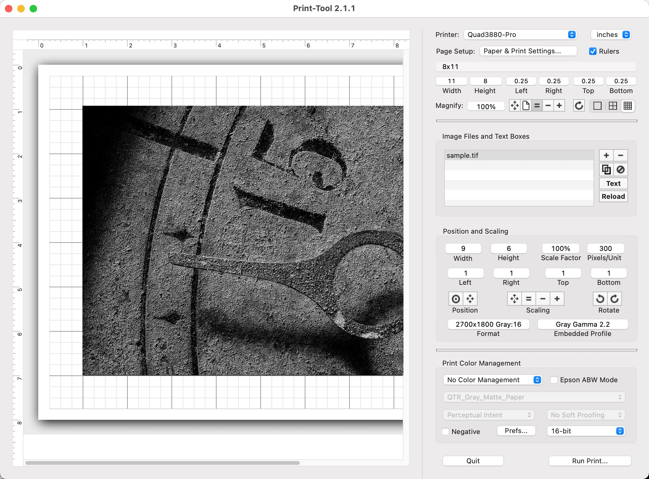
Open the image in Print Tool and specify the size of the paper and image. Above we are printing a 6x9 inch sample image on a sheet of 8x11 inch paper. This will produce a 1 inch border around the photograph. We have trimmed a sheet of 8.5x11 inch paper to 8x11 inches and placed it in the printer.
Color Management has been set to No Color Management and Prefs has been set to 16-bit.
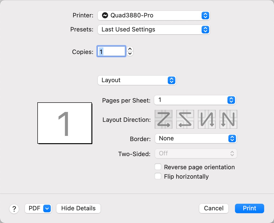
ClickRun Print
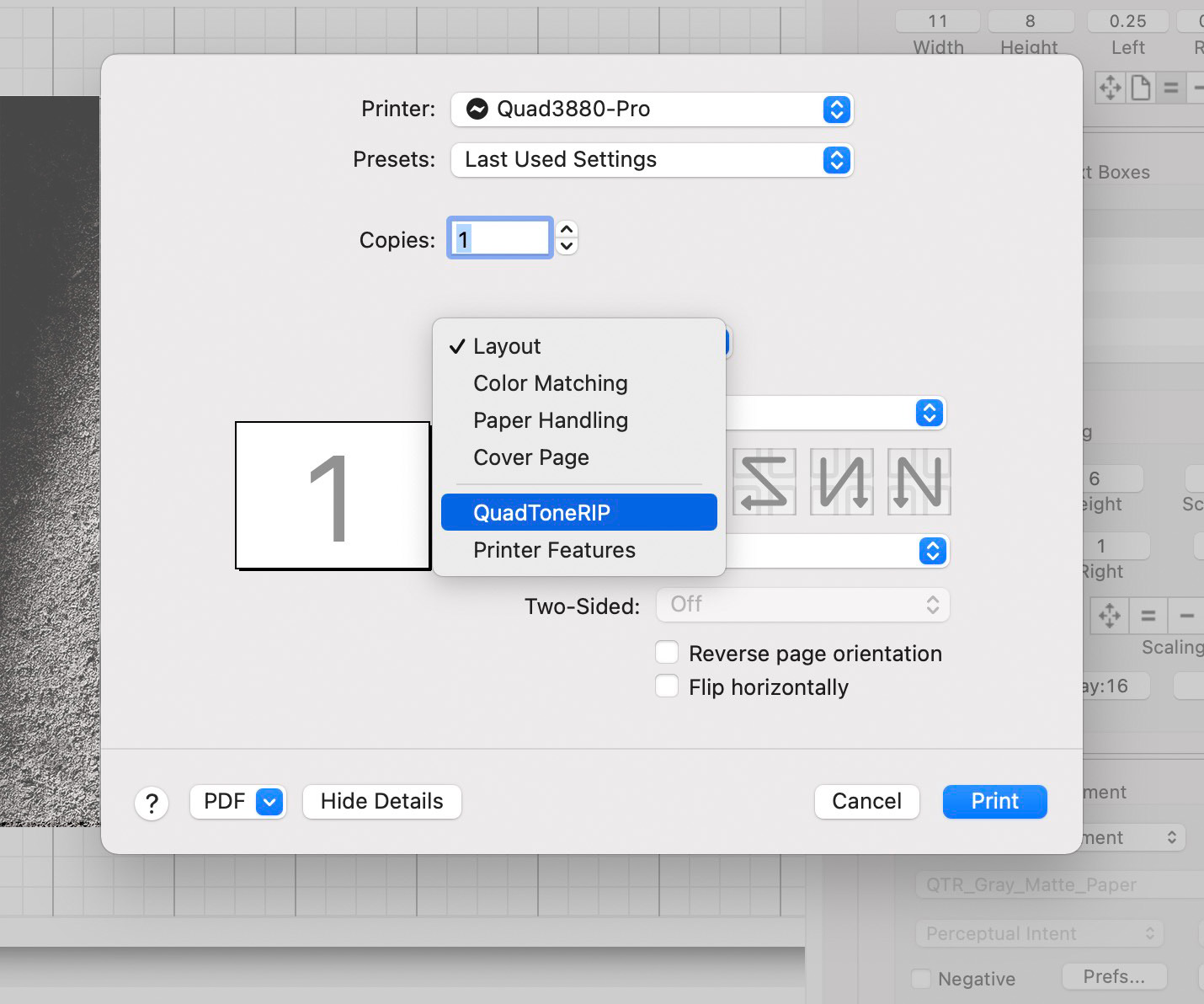
On earlier versions of MacOS the following dialog appears:
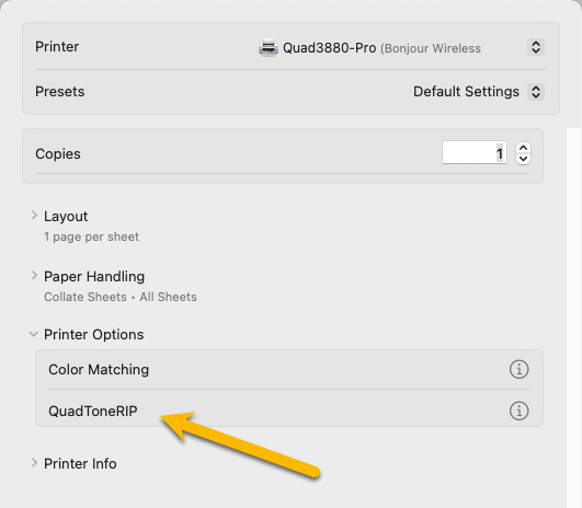
On MacOS Sonoma, the following dialog appears:
On earlier versions of MacOS, change the setting from Layout to Quadtone RIP
On MacOS Sonoma, choose QuadToneRIP.
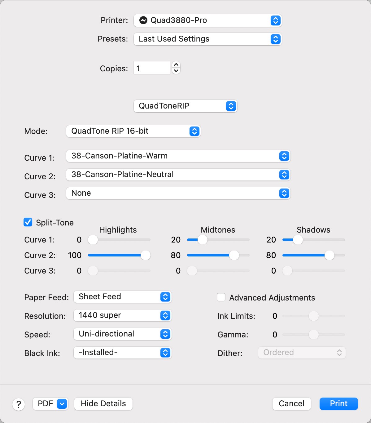
On earlier versions of MacOS, specify the Quadtone RIP settings as follows:
On MacOS Sonoma, specify the Quadtone RIP settings as follows:
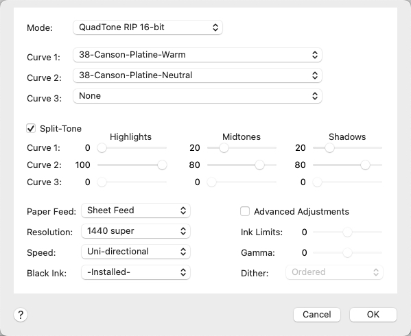
Choose the curves for Canson Platine and specify the settings and ink levels as shown above. The ink settings apply a 20% warm color and 80% neutral color to the shadows and midtones. The highlights get 100% neutral. Remember that every paper is different and responds to these colors in its own way. With Canson Platine, even a modest amount of warm tone goes a long way.
Feel free to experiment. Be sure to compare your images to a neutral grayscale print for reference. Please contact me with any corrections, questions or comments.