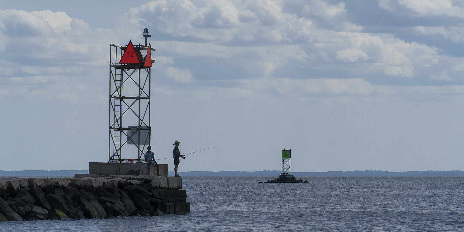
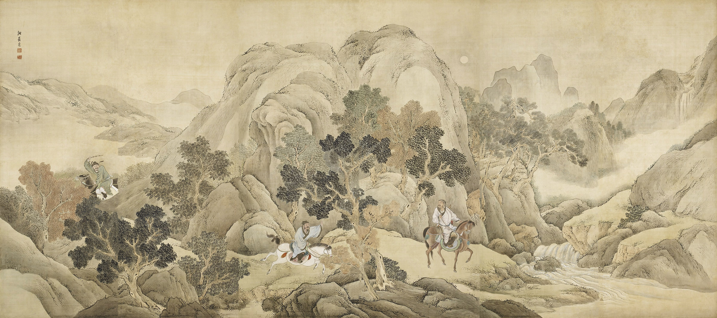
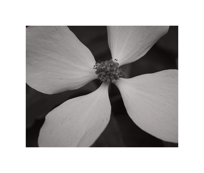
Perhaps I have made too many photographs. Has it gotten to the point where they are more about the composition than the subject?
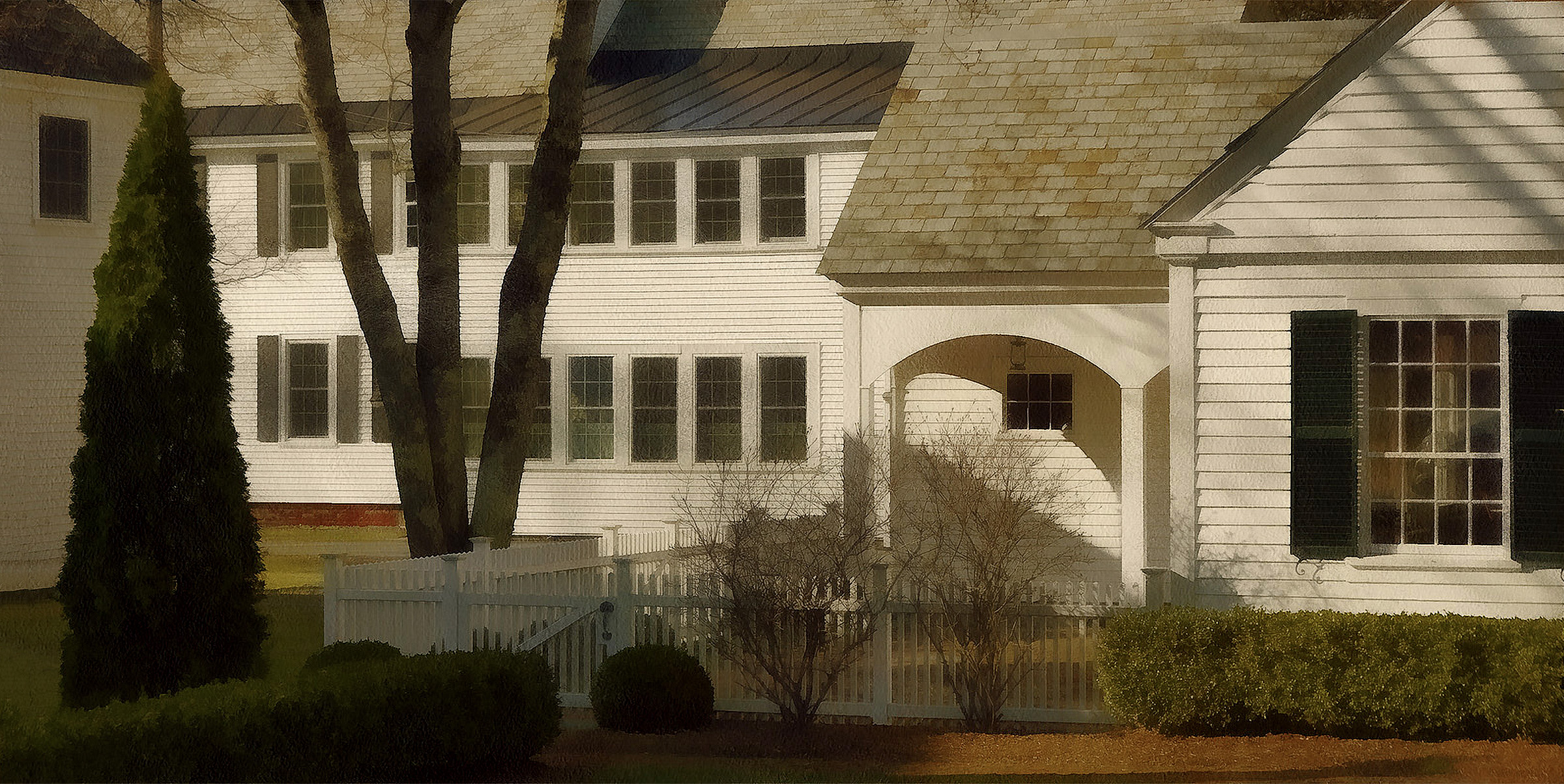
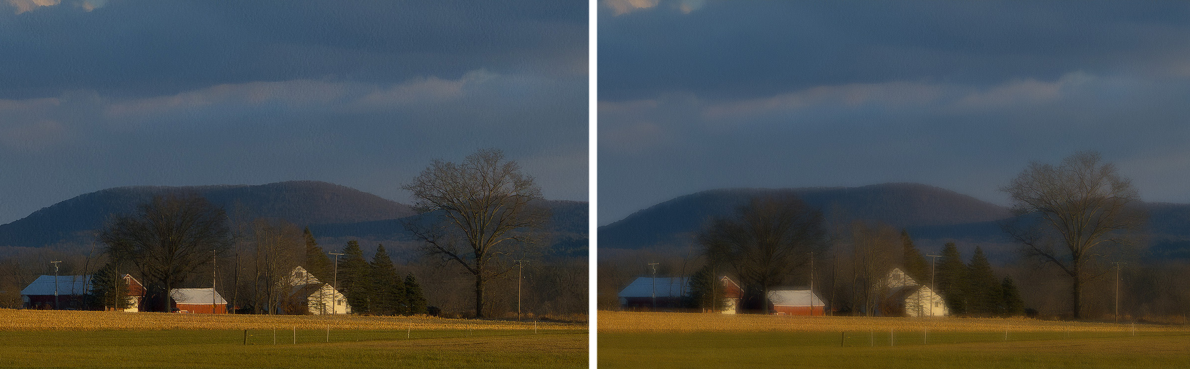
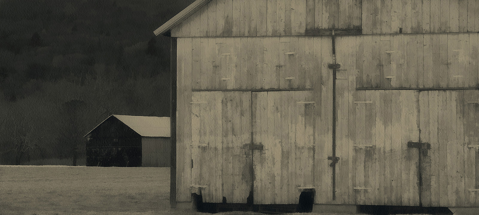
For certain images, reducing the level of detail is an improvement. Showing fewer literal details, we can place greater emphasis on color, composition and artistic feeling.
Click here to view 120 interpretive images. In some cases, we have merely added a paper texture. In other cases, we have reduced the level of detail, adjusted the color palette, or added painterly artifacts. Every image gets its own treatment.

One of the first lessons that Fred Picker taught his students, was the importance of precise camera position. Back in the days of Large Format film photography, subjects were stationary and cameras were heavy. We always used a tripod.
Leaving our equipment aside, we would walk around to find the best shooting position. Finally, we would place the camera on the tripod and make the shot. This approach helped us develop our powers of observation. Click here to view 34 images that required careful positioning of the camera.

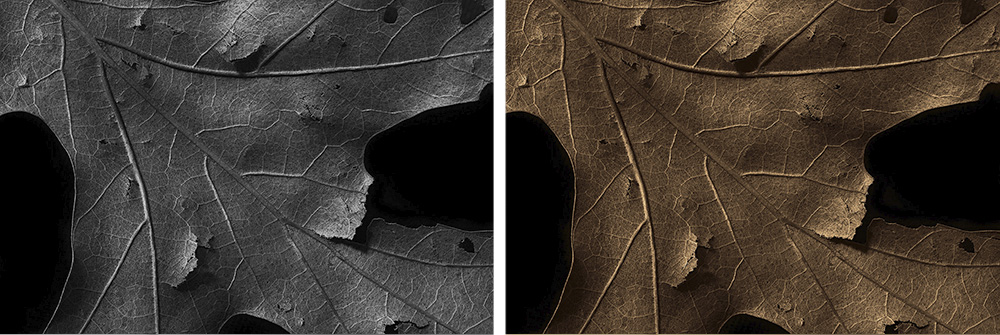
Sometimes, colors just get in the way. Click here to view 172 images that are monochrome: not black and white, but lightly toned.
- Like the countless Kodak and Fuji color prints produced over the decades, inkjet images start to fade and shift as soon as they roll off the printer. Images printed onto metal and glass are also subject to fading and discoloration.
- Experts define image permanence with regard to how long it takes for colors to fade and shift by a noticeable amount. There is no official standard for "noticeable".
- Every combination of printer, surface and ink has its own fading profile: each color fades and shifts at its own rate.
- Typical longevity testing is performed under controlled humidity and lighting conditions that are rarely encountered in the real world (read this report from Wilhelm Imaging). For longevity tests not sponsored by printer manufacturers, see the Light Fade Test Results at Aardenburg Imaging.
- Inkjet prints are subject to damage by water, light, atmospheric contaminants and framing materials. Inkjet papers are composed of a backing layer and an inkjet receptor coating. They discolor and disintegrate over time.
- Galleries and photographers who sell them (and the companies who sell printers, paper and ink) may be reluctant to emphasize this point but ironically, the best way to preserve inkjet prints is to store them in total darkness at low temperature and humidity.
- The most stable inkjet images are monochrome, printed with Carbon pigment on cotton rag paper.
- Incandescent, florescent, daylight, LED and skylight have their own color spectra. The same inkjet print will look different under every kind of lighting.
- In practice, there is no such thing as "standard" gallery or home illumination. Many galleries and homes use a random combination of light sources at varying levels of brightness throughout the day.
- Printing papers which contain optical brightening agents look blue-white under daylight and magenta under incandescent light. For further discussion, see OBAs and Metamerism: Color Shift.
- Good monitors can be easily calibrated to display accurate colors. See Calibrite and Portrait Displays
- Good monitors have a wider brightness range than prints.
- Good monitors now have higher resolution (pixel density) than the human eye can perceive.
- Digital images do not fade or shift. Like music and video files, they don't wear out or change appearance, no matter how many times we view them.
It's fairly easy to mimic or even improve upon the effect of classic portrait lenses, using either the Gaussian Blur or Lens Blur tool on a separate layer in Photoshop. Click here to view a 1-minute video tutorial.

Simplicity can be refreshing. Click here to view 30 images that are mimimalistic... more or less :-)

My photographs currently have an average aspect ratio of 10 x 15.5, but the trend is towards wider images. The 29 photographs in this collection have an aspect ratio that is wider than 1x2. They look best on a large monitor.

This video explains how to improve the colors and brightness range of a color photograph, using the Black and White filter in Photoshop.

Toning our images in Photoshop we can multi-tone with an unlimited number of shades. Digital toning can replace printer-centric approaches like Quadtone RIP and Piezography, which by comparison are limited and cumbersome. With digital toning, there is no need for a dedicated printer, proprietary inks, special cartridges, custom profiles, etc. Because we tone the image itself, there is actually no need to print at all... unless we want to.

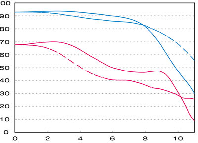
If you shoot raw files, you may not be aware that typical raw profiles automatically "enhance" your photos by adjusting the high and low tones. All of Adobe's profiles introduce an S-shaped curve which can clip the toe and shoulder of the brightness scale. Linear profiles do not contain that added tone curve. Your camera is likely recording more information than you realize.
Above is a photo taken under high contrast lighting, viewed in Adobe Camera Raw. The default
Adobe Color profile was used on the left and a linear raw profile for the camera
was used on the
right. At first glance, the version on the left looks more "snappy", but notice that the linear version
has more detail in the shadows and highlights. It looks more realistic, with greater subtlety.

Above is another example. The Adobe
Color profile (on the left) has basically discarded the high values.
Judging by that version, we seem to have seriously over-exposed the shot ! Using a linear profile on the
same raw image (on the right), we find out that the camera actually did a fine job: it captured the full
tonal scale.
Once the low and high tones have been clipped by an overly aggressive raw conversion, we can't get them back with further adjustments. Perfectly smooth images like the one above may not be possible if we convert from raw using a typical raw profile. Modern sensors are very impressive - don't we want to see what they actually record?
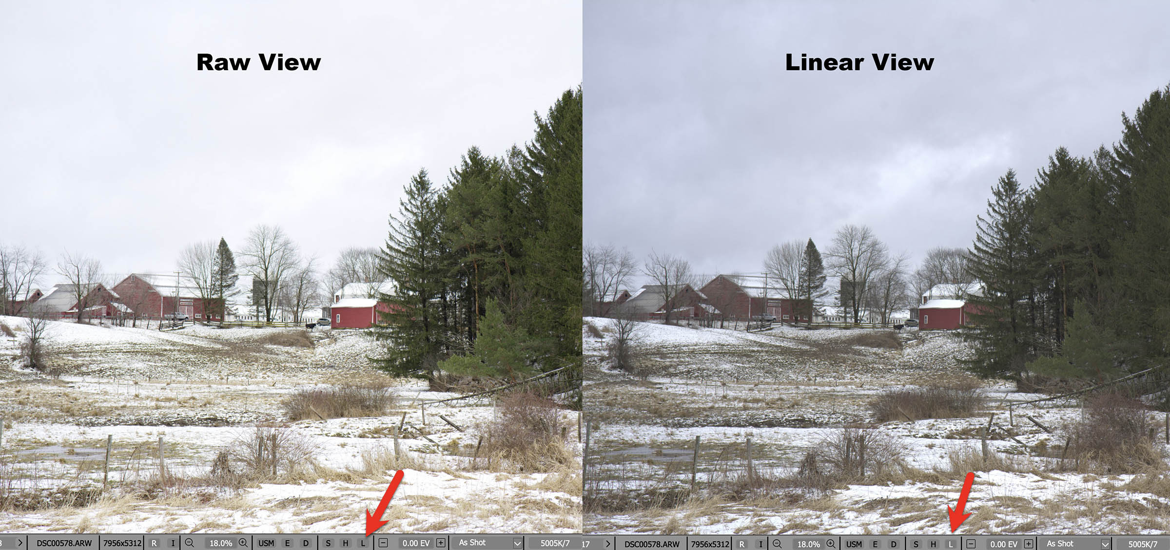
Above is another typical example where the raw file contains a longer tonal scale than our usual tools would have us believe. Using FastRawViewer, we can
instantly examine raw files in both linear and non-linear modes: just press Shift+L to toggle back and forth, or click on the letter L.
For information about linear raw profiles, visit Tony Kuyper's excellent Linear Profile Repository, where you can download free linear raw profiles for a wide variety of digital cameras and find links to many more articles on this topic.
To make your own linear raw profiles, see Linear Profiles for ANY CAMERA! and Make a Linear Profile easily in SECONDS!
Non-Adobe users: see How To Use Linear Profiles in Luminar, ON1, Affinity, PhotoLab 4 & Exposure X6.
The freeware program RawTherapee supports a fully linear option when converting from raw.

This approach is analogous to proper film
scanning: see Scanning Tips with EPSON and VueScan Software
If this sounds like using a cold diffusion light source in the darkroom to avoid the Callier Effect which blocks high values, you're probably
old enough to remember Fred Picker's 1974 classic text Zone
VI
Workshop, which is still available on Amazon.

You can download a PDF version of the book here. For the section on the Callier Effect and diffusion light sources, see Enlarger Characteristics on page 59.

If you've ever used multiple monitors on a Mac, you
know that by default, macOS only provides a toolbar at the top of the main display - even when we are
using multiple monitors. This makes life very difficult...
...because we always have to move the mouse (and our eyes) back to the main screen to get to the menu. Perhaps this accords with Apple's minimalistic design philosophy, but the whole point of using multiple monitors is speed and convenience. For every monitor, there should be a toolbar along the top, don't you think?
Fortunately there is a solution, and it doesn't require us to install any after-market software. Many thanks to macOS ToolBar on All Screens for sharing a simple workaround which places a toolbar at the top of every screen - and every toolbar conforms to whatever application has focus on that screen !
In a nutshell, enable the setting Displays have separate Spaces. That's it.
If you have the dock along the bottom of the display, then on whichever screen you're active, if you move the mouse beyond the lower edge of the display, the dock will move to that display. You don't have to go back to the main display every time to use to the dock.
Do you use lenses for which Adobe has a profile, but
DxO does not?
- Open the raw file in DxO Pure Raw and save it as a DNG file
- Open the DNG file in Adobe Camera Raw or Lightroom and apply the lens profile along with other corrections
- Save the file as Photoshop/TIFF for subsequent creative editing. (I prefer Photoshop to Lightroom for all but the most trivial corrections: for explanation, see Tutorial Videos)
This is a good workflow when shooting with older lenses like the 75mm Voigtlander f/2.5 Color-Heliar, for which there is an Adobe profile which corrects slight distortion and color-fringing.

Photograph by Christoper Mark Perez
Was this photo of a WWII re-enactor taken using a Linhof Tech II 5x7 view camera, a Fujinon-A 240mm f/9 (wide open), and Ilford FP4+ film?
See Looking More Deeply by Christoper Mark Perez to find out.
One of the great testers of Large Format optics back in the day, Christopher Mark Perez continues to share valuable information.

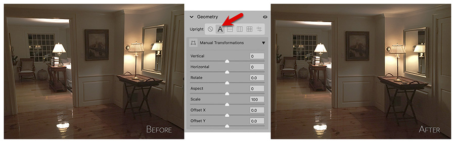
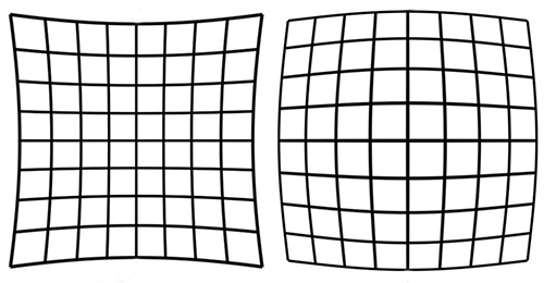
Photoshop's Adobe Camera Raw and Lightroom provide the Geometry tool to correct
perspective automatically and/or manually. It can be used with all types of images, not just raw files.
Here we have corrected a rather skewed cell-phone snapshot, by merely clicking the A
button for Auto: Apply balanced perspective corrections.
We can even combine them in ways that were unimaginable or impossible in the darkroom. For a brief introduction see Toned Monochrome Images with Photoshop. For several more approaches to toning, see Additional Methods of Toning in Photoshop.
Often overlooked, aspect ratio is one of the more important elements in fine art photography because it determines the overall compositional structure and feeling of the work. Every aspect ratio has its own flavor and as they say, "Variety is the spice of life".
To view a catalog of images arranged according to aspect ratio, click here.


.jpg)
According to the Wikipedia article Double Square Canvases, Vincent Van Gogh used this ratio "almost exclusively during the final weeks of his life in Auvers, in June and July 1890." The same article mentions that Van Gogh was familar with paintings of other artists working in the 1x2 aspect ratio, such as Charles-François Daubigny.
The great Chinese painter and poet Ni Zan (1301-1374) often used the 1x2 ratio for his hanging scrolls. The great Japanese ukiyo-e artist Utagawa Hiroshige (1797 - 1858) used this ratio for his tryptich View of the Whirlpools at Awa. This aspect ratio has also become important in Cinematography: read What is 2:1 Aspect Ratio (Univisium) & Why Are Directors Switching Over? To view 33 photographs in the 1x2 aspect ratio, click here.
_Awa_Naruto_no_fuukei.jpg)


 With curvature
of field a lens
may focus sharply in the center but the edges will focus at a different distance. The plane of sharp
focus
is not flat. It extends forward from the lens like a curved wave front. The curve may be simple or
complex.
This is determined by the optical design of the lens, not manufacturing. Better lenses and macro designs
exhibit flatness of field: they do not suffer from this problem.
With curvature
of field a lens
may focus sharply in the center but the edges will focus at a different distance. The plane of sharp
focus
is not flat. It extends forward from the lens like a curved wave front. The curve may be simple or
complex.
This is determined by the optical design of the lens, not manufacturing. Better lenses and macro designs
exhibit flatness of field: they do not suffer from this problem.
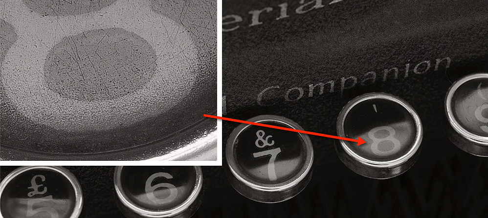
With de-centering every corner of the image focuses at a different distance. A misalignment of internal elements has been overlooked by quality control. To avoid de-centered lenses, some photographers routinely purchase several samples, keep the best and return the others to the retailer. Budget-priced lens adapters and extension rings can cause de-centering.
With focus shift, adjusting the aperture moves the point of sharp focus closer and farther. This is determined by the optical design of the lens, not manufacturing. For optimal results it's best to focus at actual taking aperture, which is easy with manual-focus lenses. One reason that cinematography lenses are more expensive than still lenses? No focus shift. See Cinema Lenses: What Are You Paying For?
To get around these problems, we can shoot at small apertures and rely on increased depth of field to get everything in focus, but that's not an ideal solution since image quality starts to degrade once we pass the best aperture. Besides, sometimes we want to shoot at wide apertures.
Some cameras let us compose and shoot in Black & White but they save a full color Raw file. With recent improvements to Adobe Bridge, we have the option to browse monochrome images as they were envisioned.
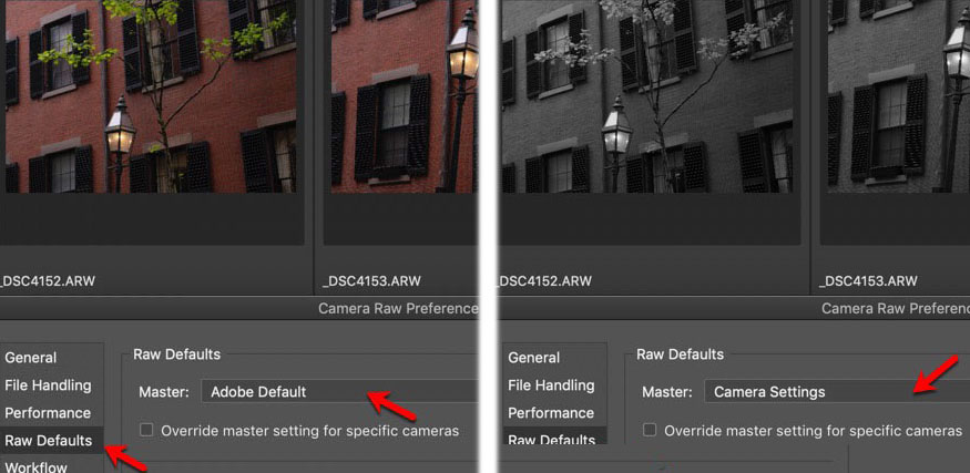
To view files as they were captured in monochrome, go to Adobe Bridge 2020 > Camera Raw Preferences > Raw Defaults and change from Adobe Default to Camera Settings.
FastRawViewer also lets us browse B&W photos as they were taken - in monochrome - or as they were saved - in color. As the name implies, it's a very fast application, with versions for both macOS and Windows. To browse in monochrome, select View > RGB/Channels/BW > BW Conversion
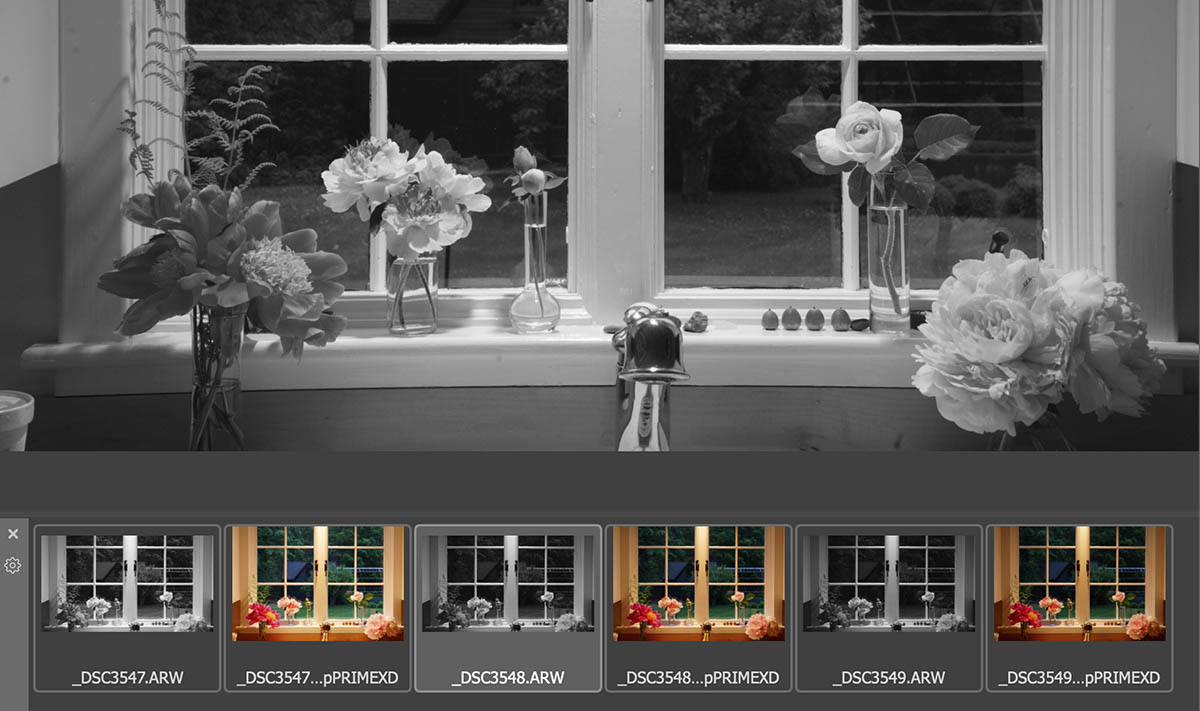
Browsing with FastRawViewer
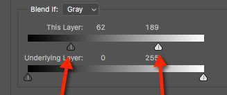
Remember that sharpening should be the last step, performed after all other corrections and adjustments.
When sharpening an image, strange artifacts often appear at the high and low ends of the tonal scale. Here's an improvement: sharpen the mid-tones only.
- Duplicate the layer that you intend to sharpen.
- Select the Layer Style of the duplicate layer.
- Adjust the Blend If sliders to remove the low and high end of the tonal scale. The result is that only the middle of the tonal scale has been selected.
- Sharpen the new layer to taste.
- Do not merge the layers before saving. Save the file as a PSD or TIF file with separate layers intact. You can change or even discard the sharpening layer any time you like, depending on the size of your print.
Some images automatically look sharper than others. Because of visual cues, they convey an impression of sharpness. See Two Barns: One Sharp, One Not for more explanation.
Shooting on a tripod for best image quality, it's not always appropriate to use the camera's self-timer to minimize camera shake. Sometimes we need to work quickly, shoot at an exact moment, perform repetitive manual focus-stacking or appear in our own group portrait.
The Sony Wireless Remote Commander is an inexpensive and portable tool which communicates with the camera's infra-red sensor. It supports remote shutter release, delayed shutter release, video start/stop, image review and deletion. Click here to watch a brief YouTube video.
Without sufficient access to fast RAM, Photoshop will hang, pause, delay, spin... etc. Photoshop really wants RAM for its scratch disk. To eliminate these problems and gain performance, your scratch drive should be very large and it should be on its own dedicated drive. This is easy on a Windows machine, where we can configure additional drives before or after purchase, but newer Mac machines ship with one drive only.
If we want a cheap and easy separate Photoshop scratch disk we can simply plug in an external SSD drive and specify it in Photoshop > Preferences > Scratch Disks. There should be nothing else on the drive and it should only be used as a scratch disk.
Be sure to specify the scratch disk as the first disk in the list, before your main drive. This frees the main drive to provide actual program code, while the scratch can serve as a dedicated disk for temporary memory. Drag the scratch disk entry above the main disk. Power users can specify multiple scratch disks.
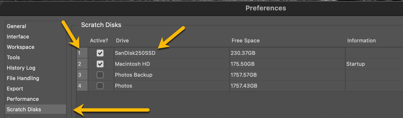
Of course it's best if we have an internal SSD with its fast on-board connection to the computer, but even an external SSD drive will be better than no separate drive at all, especially if the drive uses a fast connection like USB 3 or Thunderbolt 3. The more RAM you have, the more Photoshop will use, so get a much larger SSD drive than you think you'll need. I use a 250 GB SanDisk External SSD with a USB 3.1 connection.
 When we orient a digital camera in portrait mode on a typical tripod head, movements are restricted and
the
camera sits off to the side of the rotational axis. The Photodiox
Exxy L-Bracket solves this problem at an
affordable price-point.
When we orient a digital camera in portrait mode on a typical tripod head, movements are restricted and
the
camera sits off to the side of the rotational axis. The Photodiox
Exxy L-Bracket solves this problem at an
affordable price-point.
With an L-bracket, shooting in portrait orientation is just like shooting in landscape mode: all tripod movements are available to us and the camera can be centered over the axis of rotation: we can stitch vertical images together to make images of considerably higher resolution. Not absurdly wide panoramas: photos in landscape mode with optimal quality.
Below is a photograph stitched from 3 overlapping vertical images made with a 42 megapixel Sony A7RII and an affordable used 75mm lens. Cropped to the 4x5 ratio, the resulting file is 80 megapixels. Each section of the final image is taken from the central portion where resolution is highest. At 80 megapixels we have matched or exceeded the image quality of far more expensive equipment but we may not need that much resolution unless we plan to make and display very large prints !

Once you attach the L-bracket to the bottom of the camera, you can mount the camera either vertically or horizontally using a standard Arca-Swiss style dovetail quick-release. The rear screen moves about freely and you still have full access to the battery and memory card. Click here for a Fotodiox YouTube video which features this product.

Some
mirrorless cameras offer a narrow choice of in-camera aspect ratios: 2x3 and 16x9 only. If we
like to compose in other
ratios, we can apply
removable painter's tape to the rear of the
electronic
viewfinder or EVF. This works well indoors, but under
bright sunshine we can't always see the EVF clearly enough for precise
composition, focus and exposure adjustment.

An affordable loupe like the Hoodman comes to
the
rescue.
There are more inexpensive models on the market, but be sure to choose one with a diopter
adjustment on the eyepiece. The Hoodman loupe works as designed: in very bright light we
can effectively view the EVF. If the EVF has been masked to a different aspect ratio, we can
compose in that ratio. In-camera control of aspect ratio would be ideal, but this
solution will mimic that missing feature at an affordable price point.
The diopter adjustment works well and we see a clear image with no barrel or pincushion distortion. The Hoodman works nicely when the camera is tripod-mounted and we wear the loupe on a lanyard. In other words, it functions best when we use it like a loupe. There is nothing to attach to the camera which might damage the paint upon removal. For my Sony A7RII, I use the 3-inch model.

If you've ever tried working at short range with a small tripod-mounted camera, you'll
know
that
minute adjustment of position can be troublesome. An affordable four-way focusing
rail like the Neewer makes
it easy. Four-way rails allow you to precisely move the camera from side to side or front-to-rear.
Be sure to choose a model where everything is geared and the positions can be
independently locked.
After shooting with a view camera for decades, many of my photographs are made at close proximity to the subject where even a slight change in camera position has a pronounced effect on composition. For example, see these photographs of Tulips which were made with a Sony mirrorless camera only inches from the flowers. Exact camera position can make or break an image.
To see a brief YouTube video about the Newer 4-way Focusing Rail, click here.
Another advantage of a 4-way focusing rail is that we can position the entrance pupil of the lens directly over the the tripod's center of rotation. This step is critical for making successful stitched panorama and mosaic images at less-than-infinity distance.
The image above was made from 16 exposures, employing both focus-stacking and mosaic stitching to provide unlimited depth of field and avoid parallax artifacts. For focus-stacking I use Helicon Focus and for stitching I use Photoshop. Helicon allows you to import RAW files directly: there is no need to save as TIF or DNG first (but it's faster if you do).

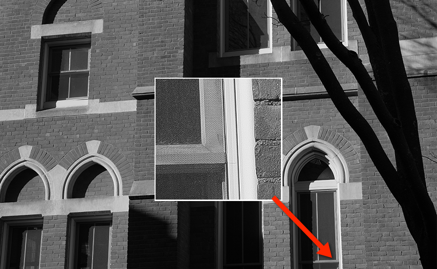
At the left is the histogram of an 8 bit grayscale image file. Because of the shallow bit-depth, we
can observe gaps in the tonal scale. This is also known as
banding. As we continue to adjust the image, banding gets worse. The more corrections
we
make to 8
bit images, the more artificial they can look. For best image quality, we want
to avoid banding.
If we simply change the file mode from 8 bit to 16 bit (Image > Mode > 16 Bits/Channel), Photoshop will not interpolate new values to provide intermediate tones as we perform adjustments.
Here's the trick: after converting to 16 bit depth, change the size of the image, even slightly. This will force Photoshop to interpolate all the pixels. As the histogram on the right demonstrates, the tonal scale is now smooth. Any subsequent adjustments to the tonal scale will be performed in 16 bit and no banding will be introduced.
Print Tool is a custom layout and printing application for macOS with Epson and HP printers. It can run standalone or with a Quadtone RIP workflow. Print Tool supports JPG, TIF, PSD, PNG and GIF files in 8-bit or 16-bit RGB or Grayscale.
One of Print Tool's many compelling features is the ability to print on custom-sized paper with equal borders. This is vital because many of the standard paper sizes do not work with 8x10 and other traditional ratios. Unequal borders can easily spoil a composition: equal borders are a must !
Click here to view the tutorial.
| Paper Size | Image Ratio | Image Size | Cropped Paper Size | Border Width |
|---|---|---|---|---|
| 8.5 x 11 | 3 x 4 | 6 x 8 | 8.5 x 10.5 | 1.25 |
| 4 x 5 | 6 x 7.5 | 8.5 x 10 | 1.25 | |
| 8 x 10 | 8.5 x 10.5 | 0.25 | ||
| 5 x 7 | 5 x 7 | 8 x 10 | 1.5 | |
| 12 x 17 | 6 x 8.5 | 8.5 x 11 | 1.25 | |
| 11 x 14 | 5.5 x 7 | 8.5 x 10 | 1.5 | |
| 2 x 3 | 6 x 9 | 8 x 11 | 1.0 | |
| 9 x 20 | 4.5 x 10 | 8 x 11 | 0.5 |
| Paper Size | Image Ratio | Image Size | Cropped Paper Size | Border Width |
|---|---|---|---|---|
| 11 x 17 | 4 x 5 | 10 x 12.5 | 11 x 13.5 | 0.5 |
| 5 x 7 | 10 x 14 | 11 x 15 | 0.5 | |
| 2 x 3 | 8 x 12 | 11 x 15 | 1.5 | |
| 10 x 15 | 11 x 16 | 0.5 |
| Paper Size | Image Ratio | Image Size | Cropped Paper Size | Border Width |
|---|---|---|---|---|
| 13 x 19 | 4 x 5 | 10 x 12.5 | 13 x 15.5 | 1.5 |
| 12 x 15 | 13 x 16 | 0.5 | ||
| 5 x 7 | 10 x 14 | 12 x 16 | 1.0 | |
| 12 x 17 | 12 x 17 | 13 x 18 | 0.5 | |
| 11 x 14 | 11 x 14 | 13 x 16 | 1.0 | |
| 2 x 3 | 12 x 18 | 13 x 19 | 0.5 |
| Paper Size | Image Ratio | Image Size | Cropped Paper Size | Border Width |
|---|---|---|---|---|
| 17 x 22 | 4 x 5 | 16 x 20 | 17 x 21 | 0.5 |
| 5 x 7 | 15 x 21 | 16 x 22 | 0.5 | |
| 11 x 14 | 16.5 x 21 | 17 x 21.5 | 0.25 | |
| 12 x 17 | 12 x 17 | 17 x 22 | 2.5 | |
| 2 x 3 | 14 x 21 | 15 x 22 | 0.5 | |
| 9 x 20 | 9 x 20 | 11 x 22 | 1.0 |
For example, I like to make proof prints on US letter paper (8.5 x 11 inch), with a 1.25 inch border. This comes out to a 6 x 7.5 inch print on 8.5 x 10 paper and is very easy to set up on Print Tool. This requires trimming our 8.5 x 11 inch paper to 10 inches long, as shown above. Another nice size is exactly 10 x 12.5 inches with a 1.5 inch border. We merely trim our 13 x 19 inch paper to 15.5 inches long.
To see how to configure macOS for Print Tool custom sizes, click here.
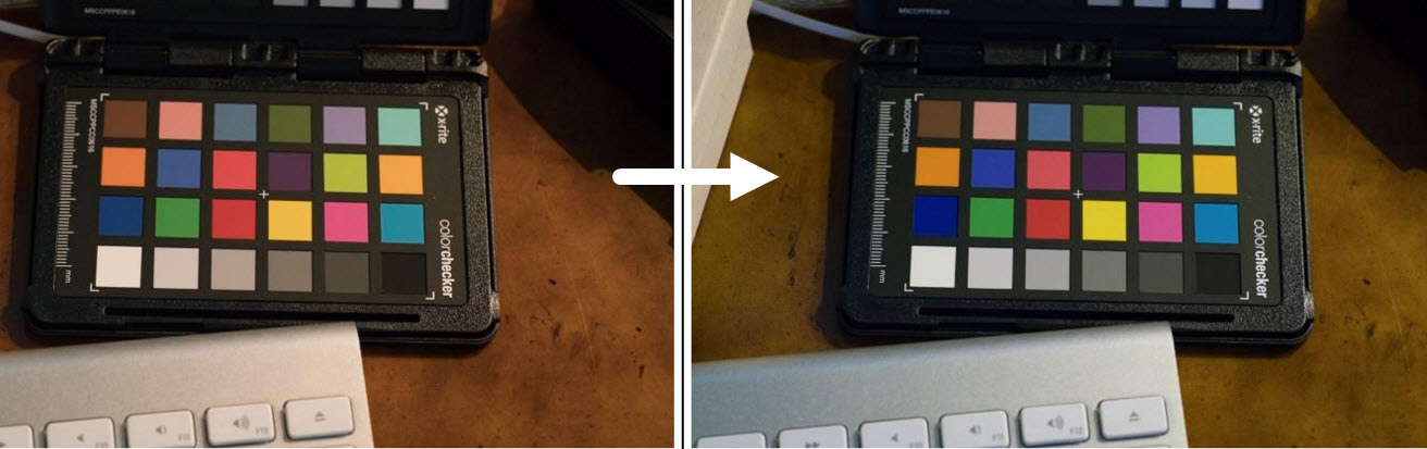
The XRite
Color Checker
Passport Photo 2 is an affordable solution consisting of a
portable target and software. It works with Photoshop and Lightroom to give you accurate color balance
wherever you shoot.
The tool contains RGB and CMYK values, gray steps and other standard color patches. The newer Passport Photo 2 also contains an 18% gray card.
The test photo above was made under typical incandescent home office lighting and shows before and after profile correction. To watch a YouTube video about it, click here and see the X-Rite promotional video here.
Sony full-frame sensors deliver high resolution in a very portable package. The 67MP Sony A7RVI full-frame sensor delivers 9984 × 6656 pixels: a 23x33 inch (56x84 cm) print at 300 dpi.
The tonality and dynamic range are superb. At ISO 100 there is no apparent grain or sensor noise whatsoever at 100% magnification. Using noise reduction software (like my favorite DxO Pure Raw), we can make clean and sharp images at much higher ISO.
To get resolution like this across the entire image, we need to shoot lenses at their best aperture and keep the camera very steady. The larger the print, the more important this becomes.
To keep up with the
latest news and discussion about Sony cameras
and equipment see
Sony Alpha
Rumors and Fred Miranda's
Sony
Forum. An official Sony shooter, Brian
Smith's blog
is highly informatve.
Brian Smith's Ultimate Guide to Fullframe E-Mount FE Lenses is comprehensive and regularly updated.
Although less frequently updated, here's another survey and evaluation of native full-frame lenses with electronic coupling for Sony E-Mount cameras by Phillip Reeve: Sony FE Lenses: a Comprehensive and Independent Guide. He also provides these additional helpful articles: The Best Lenses Below $499 for the Sony A7 Series and Beginner’s Guide to Manual Lenses on the Sony A7.
For news about digital equipment of all stripes, see Digital Photography Review.
For fine-art subjects (as opposed to snapshots, sports, wedding and fashion), manual focusing is preferable. we're rarely working quickly and we can't trust the camera to make the right artistic decision. For example, see below where sharp focus has been applied off-center.
Because the Sony provides focus-peaking and magnification, it's like using a loupe on a view camera. Mirrorless cameras provide a level of precise focus that can never be reached while looking through an SLR or rangefinder window.
Another advantage of manual focus: we can focus with the lens stopped down to the actual taking aperture. This not only helps us preview depth of field, it eliminates focus shift.
 This section now has its own web page. Click here for a
discussion of our favorite native and adapted lenses for full-frame and APS-C Sony mirrorless: zoom,
fixed focal length, manual and autofocus. Lenses for travel, macro, landscape etc.
This section now has its own web page. Click here for a
discussion of our favorite native and adapted lenses for full-frame and APS-C Sony mirrorless: zoom,
fixed focal length, manual and autofocus. Lenses for travel, macro, landscape etc.
These lenses can also be used on other mirrorless camera bodies: Canon, Nikon, Fuji, Olympus, Panasonic, Leica, etc.
 Don't purchase a set of filters for every "odd-ball" size (and carry them into the field). An
inexpensive
step-up
ring can save you money, space and weight. If you add a step-up adpater ring to your smaller
lenses,
they will take a larger lens cap and you can purchase a single set of filters.
Don't purchase a set of filters for every "odd-ball" size (and carry them into the field). An
inexpensive
step-up
ring can save you money, space and weight. If you add a step-up adpater ring to your smaller
lenses,
they will take a larger lens cap and you can purchase a single set of filters.
 This tripod is neither the largest, smallest, heaviest nor lightest - but the Bogen 3021 BN
Pro is an affordable all-around solution. It's built strong enough and
light enough. It's not made of carbon fiber but unless you are a trekker... who cares !
This tripod is neither the largest, smallest, heaviest nor lightest - but the Bogen 3021 BN
Pro is an affordable all-around solution. It's built strong enough and
light enough. It's not made of carbon fiber but unless you are a trekker... who cares !
Sorry, I do not recommend ball heads: when we adjust the camera in one direction, we lose the other two planes of orientation. Ball heads are hit-and-miss. They drift as we tighten the knob, due to the weight of the camera. For precise work, they are practically useless ! I recommend geared tripod heads for general use. For careful positioning of small cameras at close distance, I recommend a 4-way Focusing Rail.
 I
like
the
Manfrotto 3275 410 geared
tripod head, which is rated for holding cameras up to 11 pounds. It lets you make fine
adjustments in 3 directions, independently. It's small, light and strong.
It's a treat to make adjustments this way: there is no drift. I use it with cameras that are
comparatively light in weight, like wooden field cameras and digital cameras.
I
like
the
Manfrotto 3275 410 geared
tripod head, which is rated for holding cameras up to 11 pounds. It lets you make fine
adjustments in 3 directions, independently. It's small, light and strong.
It's a treat to make adjustments this way: there is no drift. I use it with cameras that are
comparatively light in weight, like wooden field cameras and digital cameras.
Geared movements let us make minute compositional adjustments, critical when shooting small objects at close distance, like these Tulip and Rotary Telephone photographs which were made with a Sony mirrorless camera. There are better geared tripod heads on the market like the Arca Swiss C1 and D4, but the Manfrotto is considerably more affordable.
 For
heavier
equipment, consider the Manfrotto
229 tripod head. It's rated up to 16 pounds and has no problem holding a Sinar
P with 5x7 back, extension rails etc.
For
heavier
equipment, consider the Manfrotto
229 tripod head. It's rated up to 16 pounds and has no problem holding a Sinar
P with 5x7 back, extension rails etc.
Here's a cold-weather tip: wrap some pipe insulation around the legs and hold it down with some inexpensive duct tape. This will keep your hands warm when you carry the tripod. Pipe insulation is very inexpensive but you will find this very helpful in winter time. It also helps if you want to carry the tripod on your shoulders: it's soft on the body.
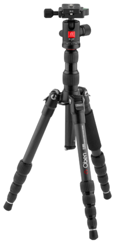 The
Oben
CT-3535 Folding Carbon Fiber
Travel Tripod with BE-208T Ball Head folds to only 12 inches and weighs only 2.5 pounds. It
fits in just about any backpack or shoulder bag and is therefore ideal for
travel. It also converts to a monopod and comes with a ball-head that will orient vertically. Ball
heads are suitable for travel when weight and size must be kept to an absolute
minimum.
The
Oben
CT-3535 Folding Carbon Fiber
Travel Tripod with BE-208T Ball Head folds to only 12 inches and weighs only 2.5 pounds. It
fits in just about any backpack or shoulder bag and is therefore ideal for
travel. It also converts to a monopod and comes with a ball-head that will orient vertically. Ball
heads are suitable for travel when weight and size must be kept to an absolute
minimum.
You can watch a YouTube video about this tripod here.
I use this combination when traveling with my Sony A7RII. When possible I replace the Oben ball head with the Manfrotto 3725 410 head shown above. Even though it weighs as much as the tripod, it is finely geared.
 A
leveling tripod base like the Manfrotto
438 sits just below the tripod head (see yellow arrow). You get a level platform without
having to adjust the legs of your tripod. This piece of equipment
doesn't weigh very much but makes life much easier - especially when shooting in the field, where
the ground is rarely level.
A
leveling tripod base like the Manfrotto
438 sits just below the tripod head (see yellow arrow). You get a level platform without
having to adjust the legs of your tripod. This piece of equipment
doesn't weigh very much but makes life much easier - especially when shooting in the field, where
the ground is rarely level.
 On the right you can see the leveling base in action. The
tripod is not level - as the red line
shows - but the tripod head is level, because we have adjusted the
leveling base beneath it.
On the right you can see the leveling base in action. The
tripod is not level - as the red line
shows - but the tripod head is level, because we have adjusted the
leveling base beneath it.
With such an arrangement, we can pan the head horizontally (or move the 3 gears of the 410 head in any direction we like) and we don't have to correct anything afterward. To adjust the leveling base, just loosen the lever and use the bubble level. It's much faster than changing the length of the tripod legs. If you've ever tried to work with a tripod that isn't level, you'll appreciate this improvement !
To see a nice YouTube video about the Manfrotto 438, click here.
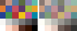
 At right is
an image which can tell you if your monitor
and printer are reasonably
color-calibrated and profiled. Click on it to see it
full-sized.
You should be able to see all the shades of all the colors. Can you
see the purple rocks in the fishbowl? Is there plenty of detail in the shadows of the sand dunes
?
At right is
an image which can tell you if your monitor
and printer are reasonably
color-calibrated and profiled. Click on it to see it
full-sized.
You should be able to see all the shades of all the colors. Can you
see the purple rocks in the fishbowl? Is there plenty of detail in the shadows of the sand dunes
?
Now print these images on your printer and see if the final results looks like what you see on your monitor. Ideally, they should match, very closely. If they don't match, then perhaps your monitor is off or your printer needs to be profiled... Probably both !
Ideally, we should have our own custom profile for every combination of printer/paper/ink that we use. The same ink has a unique response to every different kind of paper - and every printer is unique. They are mechanical devices, subject to variation. Just like musical instruments, they need to be tuned up, all the time.
Printer manufacturers like Epson make profiles for their own printers/papers freely available for download and tools like Photoshop allow you to print your images with the profile of your choice. These are not as good as getting your own profile but they're a great place to start and you can't beat the price ! it's hard to get things right, even with all the right tools. Without a calibrated workflow, it's almost impossible !
For best results with color printing, get someone like CHROMiX to make profiles for you. If you only print with one paper, you only have to get one profile made when you get a new printer. If you don't want to have a custom profile made, then at least get one of the profiles from the public domain. Thanks to InkJetArt.com for the test image.
Even if your monitor has been recently calibrated and you are printing with a custom profile for your printer/paper/ink, you may still end up struggling to match your prints to what you see on your monitor. Why? Because typical monitors are much brighter than paper. Their colors extend beyond what can be printed with paper on ink. With every generation, monitors become brighter and bolder. Fine art printing is not a consideration.

If you have a light meter, you can see for yourself that typical office illumination is such that a white piece of paper, or a white wall, gives an Exposure Value or EV, around 9. Actually, EV 9.3 is around 80 cd/m2, so for digital printing, if your photos will appear in a well-lit office or gallery, you should configure your monitor to that brightness before making adjustments.
Many homes and galleries are even darker, like EV 8, 7, 6 or lower. If you don't have a light meter you can use one of the many phone apps, like Luxi. Be sure to use ISO 100, since that is the standard.
Consumer-grade monitors don't do well at these levels: they are brighter than standard office walls and intended for general web browsing, video and gaming. That's why print imaging specialists use displays like Eizo which are intentionally designed to perform best at paper brightness.

Before editing your photos for printing and gallery viewing, you need to reduce the brightness and change the white point of your display to match the illumination of the display area. Otherwise, you may be in for an expensive surprise: wasted paper, ink and time. Typical home and office lighting is much warmer and much dimmer than noon daylight.

The Calibrite Grafilite Viewing Lamp
lets you view prints under lighting at 3 different color temperatures: daylight (5000K), store light
(4000K) and home light (2700K) and has a dimmer with different brightness levels. For a review video,
click here.
So while it's good to calibrate your monitor for 120 cd/m2, 6500K and P3 if you're watching videos or browsing the internet, making fine art prints for display at home or in galleries requires settings actually used by printers: 80 cd/m2 brightness, 5000K white point and the Adobe RGB color gamut. Before you edit your photos for printing, be sure to configure your display appropriately or your photos won't match your display.
Here's a superb video presentation from Andrew Rodney: Why Are My Prints Too Dark?. Here's a nice article on the Shutterbug website, entitled Are Your Prints Too Dark? Here's another one, by Pat Herold of CHROMiX. it's called My Printer Is Too Dark on the CHROMiX Color Wiki.
 In order to make Inkjet photo papers look whiter,
manufacturers not only bleach them, they add OBAs: Optical
Brightening Agents. Brighteners are commonly added to laundry
detergents to make white clothing appear cleaner and brighter. When exposed to
daylight (which contains UV light), the OBAs luminesce. They emit blue-white light. The brighter
the whites, the deeper the blacks look by comparison. It sounds great, no?
In order to make Inkjet photo papers look whiter,
manufacturers not only bleach them, they add OBAs: Optical
Brightening Agents. Brighteners are commonly added to laundry
detergents to make white clothing appear cleaner and brighter. When exposed to
daylight (which contains UV light), the OBAs luminesce. They emit blue-white light. The brighter
the whites, the deeper the blacks look by comparison. It sounds great, no?
The problem is that under indoor lighting, they don't luminesce, so your images look dull. With less blue, the same image suddenly looks rather different. This effect is known as metamerism, or color shift. Your print looks different depending on where you view it. While harmless for family snapshots, it's unacceptable for Fine Art prints. Traditional Silver-based photographs don't suffer from metamerism - and neither should a good inkjet print.
To make matters worse, OBAs fade over time. Even if the image looked right under daylight, it starts to look wrong eventually. The print you spent so much effort to make, is slowly replaced, so to speak, with something else.
Not all papers have OBAs: some are made with 100% Cotton Rag, have no OBAs and exhibit no color shift. Two papers I recommend are Epson Hot Press Natural and Premier Smooth Hot Press. Another brand I really like is Canson Infinity Museum Quality 100% Rag papers. Be sure to look for papers which have no OBAs. Canson writes "No Optical Brighteners" right on the front of the box. I like their Rag Photographique: it's very smooth, 100% Rag, has no OBAs and a great color.
To see how different papers and inks fade and change over time, see Aardenburg Imaging. Mark McCormick-Goodhart is a first-rate scientist and a world-class expert in the field of image permanence.

Apple's Time Machine is great for backing up your computer, but it's safest to keep your images and other important documents on a separate drive.
Carbon Copy Cloner lets you schedule tasks to back up your files - from one disk to another - as many disks as you like - as often as you like. Back up all your files, or copy only what has changed. Move a copy of your digital files to a backup disk. Back up your OS X system files to another disk. Copy your large Photoshop files to another disk. I schedule these tasks to run in the middle of the night, while I'm sleeping.

For information about Large Format cameras, lenses, scanning, darkroom, etc. click here
There is no advertising here: just a lot of free information. If you feel that this information has been helpful to you, please consider giving a small donation to support it. Any amount will be gratefully accepted !